


Even if you have limited experience with the Web, you’ve probably encountered a 404 page at some point. You know–it’s that frustrating page that appears after you type in a URL and looks something like this:
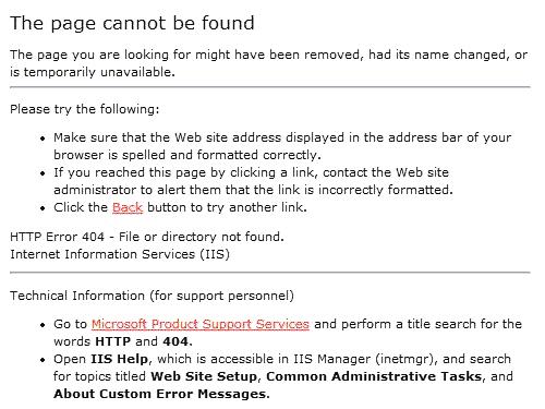
Or it may say that the page was not found on the server. Either way, you’re stuck, because if you typed in the URL correctly (i.e. no spelling errors), there is no way for you to tell if a) the URL of the page changed or the entire page was deleted, b) broken links exist on the site itself or on the external site where you found the link, or c) the site’s CMS is generating misconfigured links.
In other words, these default 404 pages don’t tell the user anything about what may have happened, where else they can go on the site, or what they can do to report a problem. The pages don’t even have any branding to reassure the user that they’re on the right track.
Now, using a default 404 page may not hurt the reputation of some websites, but for online businesses and others who need to attract visitors, this kind of error message can scare potential contacts away. If you’re trying to make conversions, you can’t depend on default messages and styling. You’ve got to hold a contact’s hand every step of the way and always keep your brand in front of their eyes.
Naturally you should customise your 404 page to suit your needs, but here are a few guidelines:
- Make sure the custom error page returns a 404 HTTP response code.
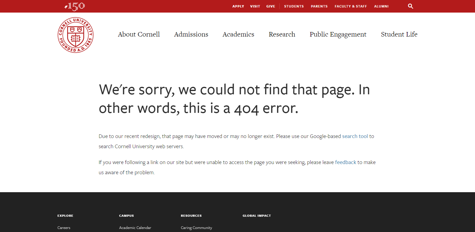
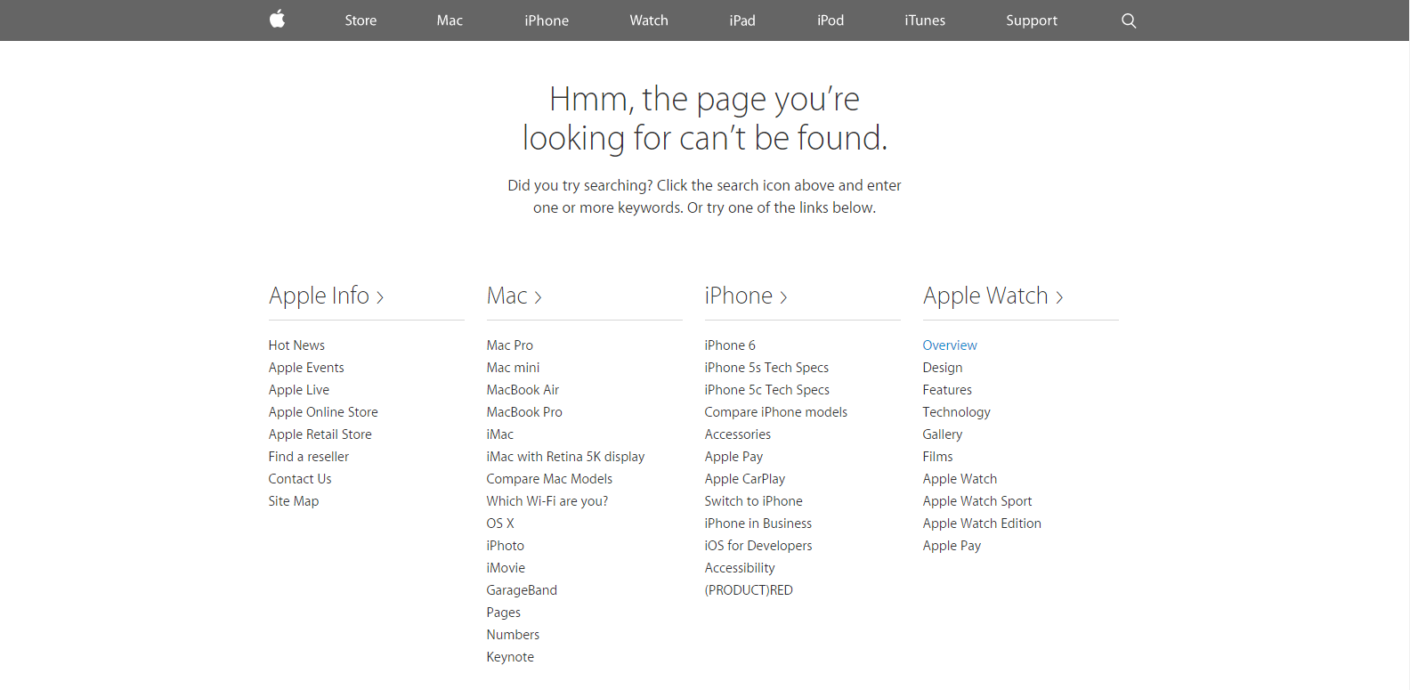
- Write a clear, informative message to the user in a friendly and welcoming tone, perhaps apologising for the error and explaining what happened. You could also ask the visitor to check the URL they’ve entered (for spelling mistakes).
- Design the error page to look like the rest your website – keep the main navigation menu, show the website’s logo, use the same colours, fonts and so on. Consider adding an interactive element or using funny imagery to minimise the visitor’s frustration.
- To prevent a user from leaving your site, add links or elements that require the user to take action, such as
- A link to your home page. This could be a simple text link such as “Home” or your site’s logo. Include your main navigation menu, whether it is the header or footer links.
- A few key links to your most popular categories or pages on the site.
- A link to your site map if there is one; this can be useful as a site map presents all the important links on your site.
- A search box to the page – this will help the visitor to find exactly what they were looking for.
- A request for the visitor to report a broken link. This can be a link to the “Contact Us” page or include an email address. Possibly ask the user which web browser and operating system they are using when the broken link occurred.
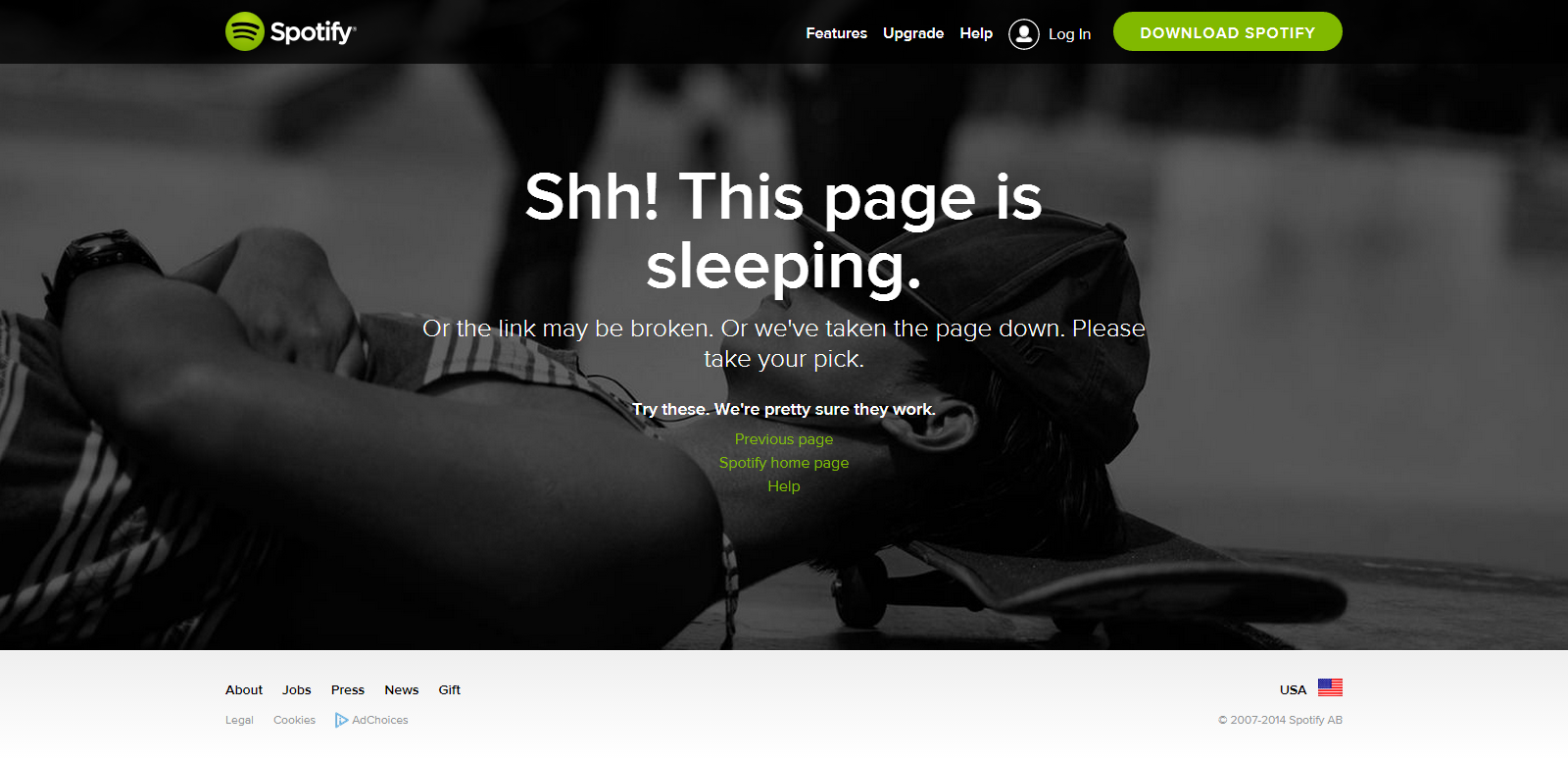
To close, here are some examples of custom 404 pages using best practices.

Feature image © zolverine


