Several exciting web design trends have emerged in 2015. Now that we’re in the last quarter of the year, we’d like to showcase some of our favourites, using examples from Awwwards (which if you haven’t checked it out yet, is an amazing source of inspiration for new designs). We hope these will inspire our fellow designers to improve their techniques and strive towards even greater creativity, as well as help anyone in the market for a new website to find features that can set their brand apart online.
1. Full-Screen Backgrounds
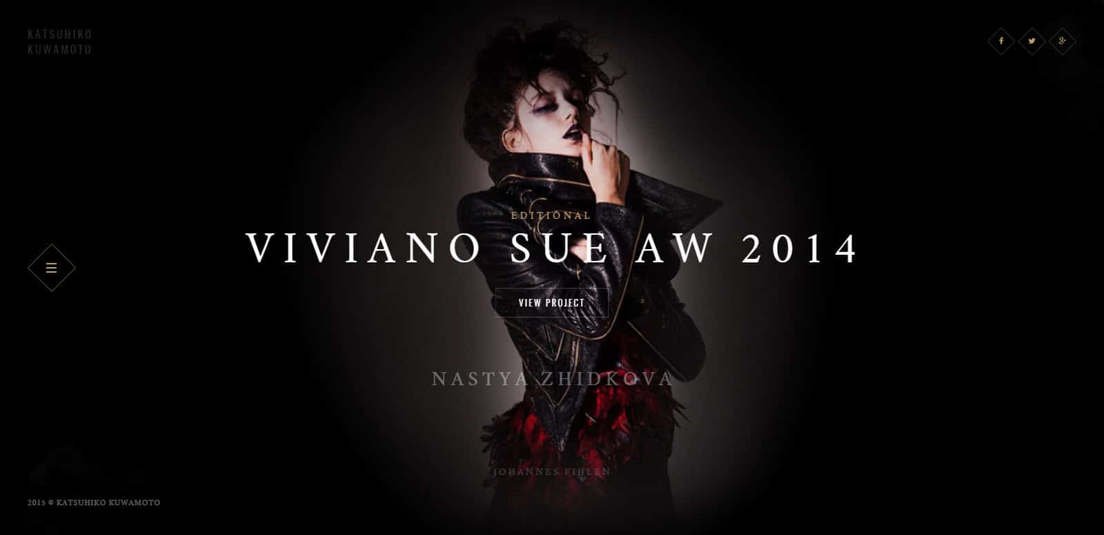
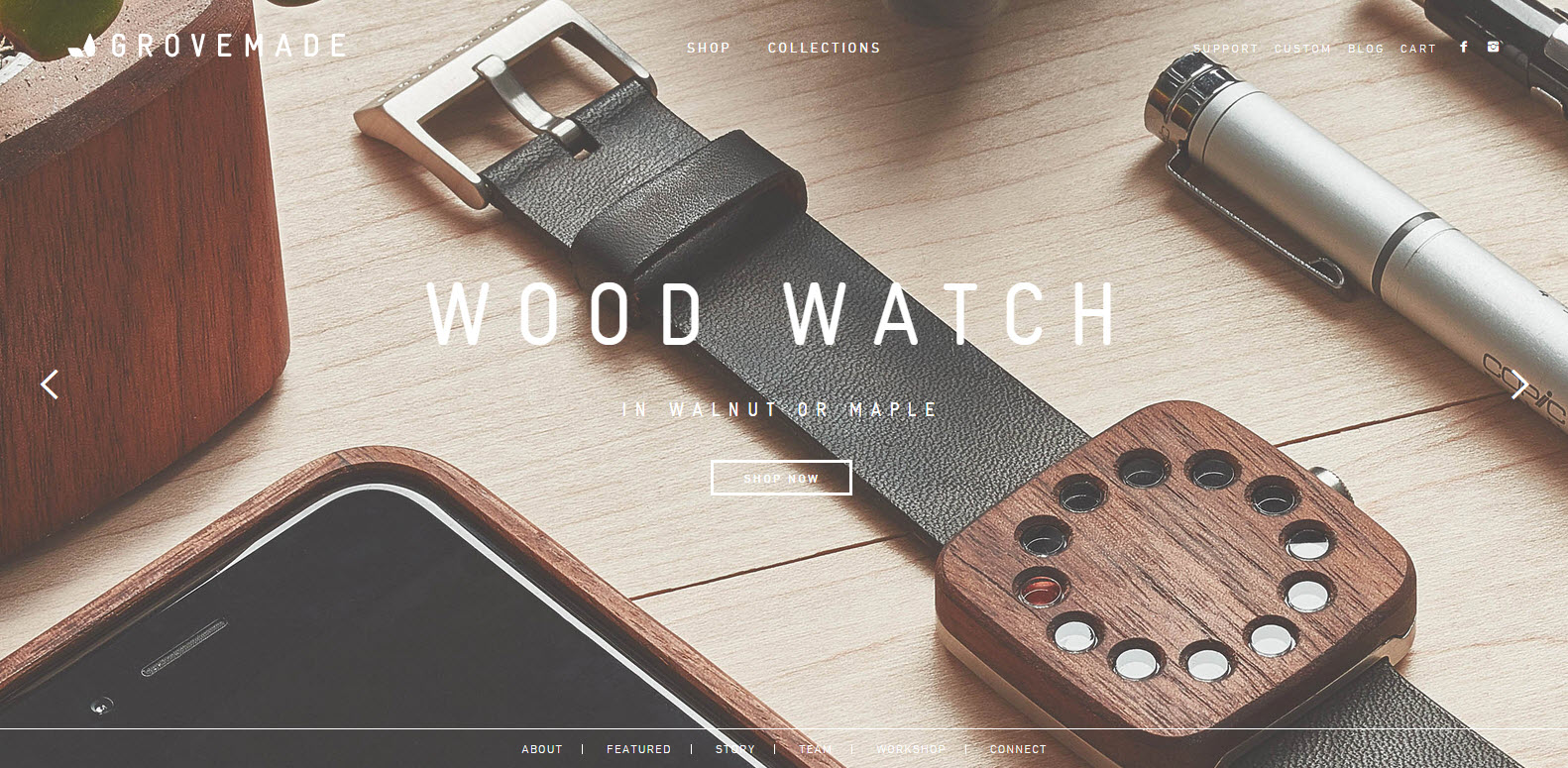
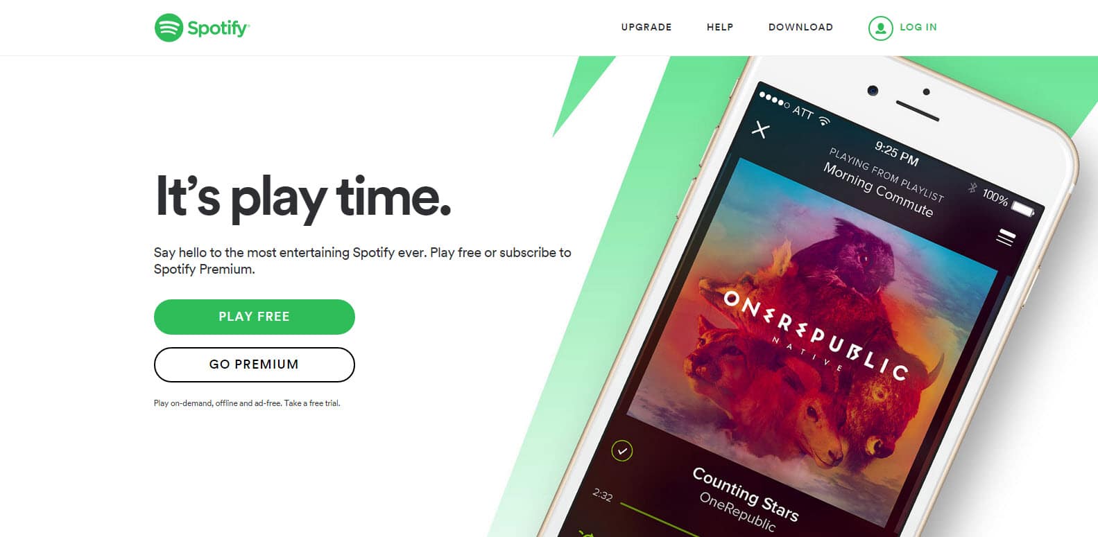
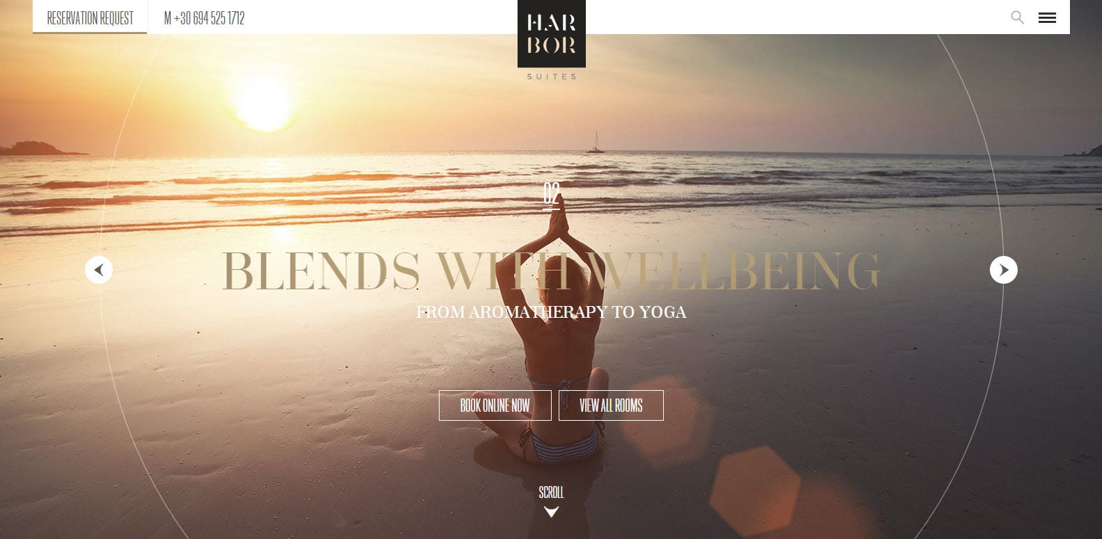
One of the most noticeable web design trends you’ll see today is the full-screen background, which resembles a magazine spread or album cover. Whether it’s a static image, a slideshow of images, or a video, this feature is designed to present a complete picture of your brand to the visitor when they land on the homepage. If the background is high-quality and engaging, the visitor will feel immersed into the world of your brand.
A single-screen background necessitates minimalist design (which is a trend unto itself). For example, minimalist designs can use transparent headers, where the logo and menu items “float” over the background; ghost buttons (see #2); and bold headings overlaying the background that send a clear, lead-generating message. With such a background, it’s also possible to experiment with menu position and style.
2. Ghost Buttons
As we mentioned, ghost buttons work well with full-screen backgrounds. Empty or semi-transparent with colored borders and text, they are able to “float” without breaking up the background imagery or distracting the user. They make great call-to-action buttons, such as “Shop Now” or “See More,” and allow you to open up the rest of the site through scrolling. Thus you can guide users to certain sections of your site.
3. Sticky Headers
Along with ghost buttons, “sticky” or fixed headers go hand-in-hand with infinite scrolling. These headers stay at the top of the screen no matter how far the user scrolls. This is useful particularly on mobile devices, when the user may get lost after scrolling without a navigational aid. Web designers often make the header transparent on a full-screen background and then turn it to a solid color once the user starts scrolling.
4. Single-Page Websites
Multi-page websites are still alive and well, but single-page sites are definitely gaining in popularity. That’s understandable, because they facilitate creative storytelling and visuals, promote app- or game-like interaction through animation and touch controls and entice users to spend more time on the site.
You’ll often see single-page sites combined with full-screen backgrounds and parallax (where the background slides under the foreground).
Read more about single-page sites and infinite scrolling.
5. Responsive and Mobile-Friendly
With more users viewing websites on mobile devices, it’s crucial that any new design be responsive so that your website looks great on any screen. There’s nothing more frustrating than trying to view a website on your phone which has tiny menu items or sections that are cut off. Some web designers are taking it a step further by building for mobile first instead of as an afterthought. They make sure that the most important sections of the website are easily accessible on mobile devices.
6. Grid Layouts
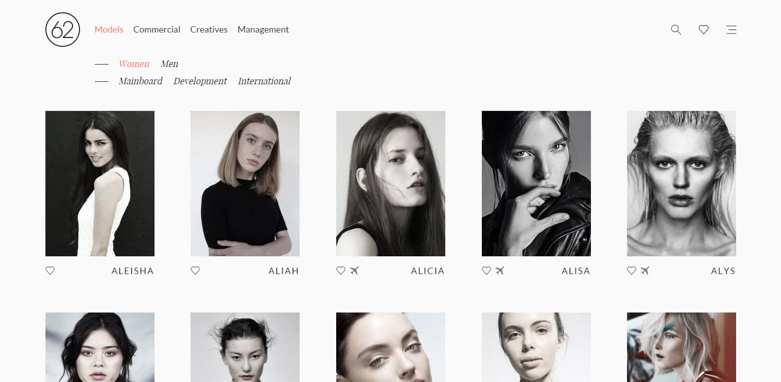
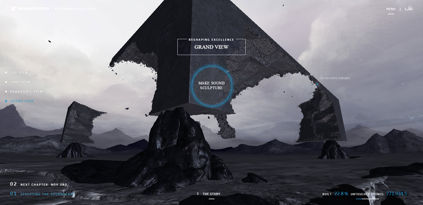
Though grid-based layouts have been around for a while, web designers are finding that arranging content in blocks or tiles not only provides an interesting look but represents a flexible and responsive layout that stacks neatly on small screens. Grids aren’t limited to galleries anymore; you can use them for an online shop, a project portfolio, a blog, or another type of content.
7. Flat Design
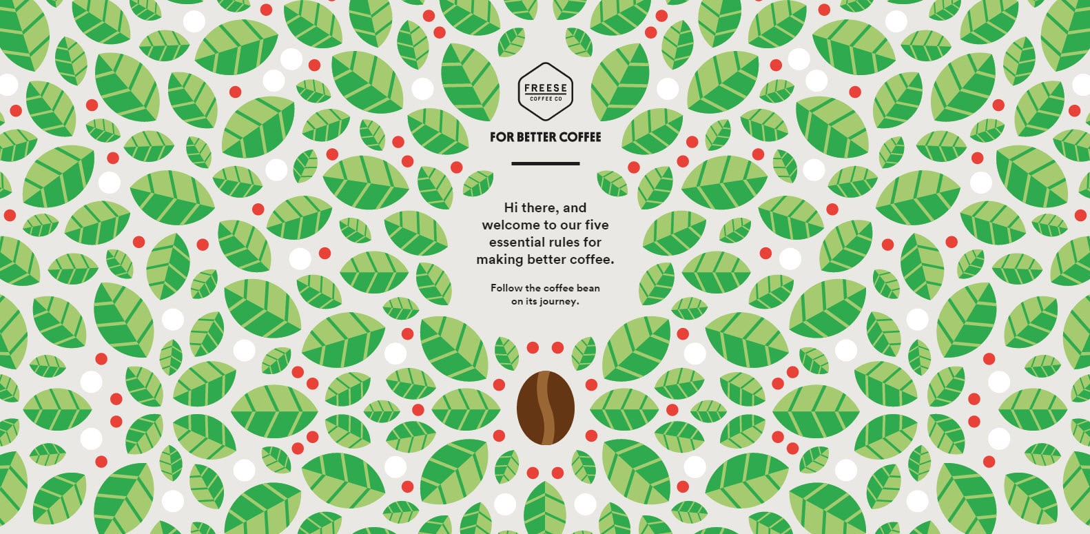
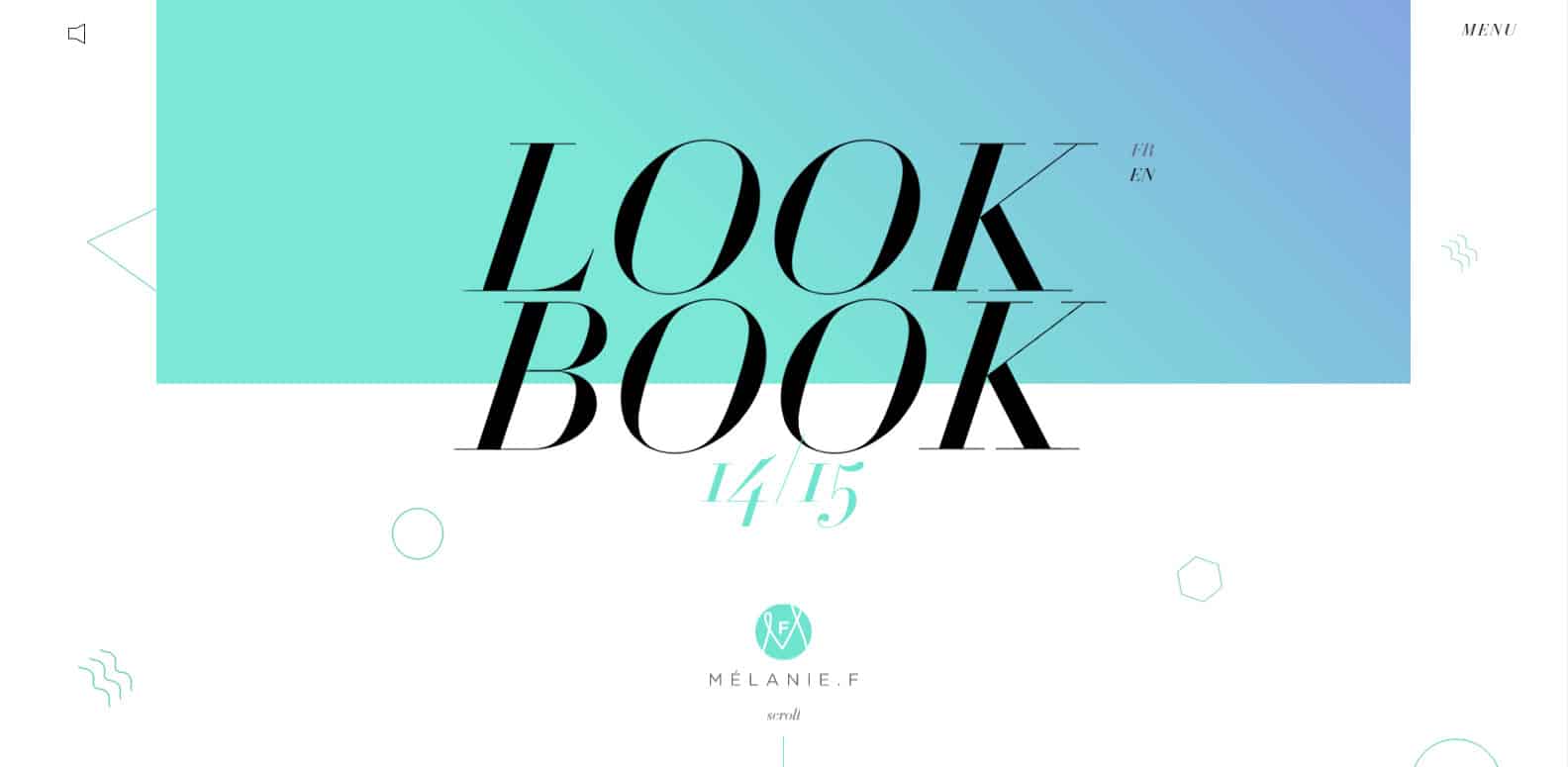
Once upon a time, web designers “embossed” menus and buttons so they stood out in relief on a background. This technique has given way to “flat” design, which keeps everything 2D and follows the general trend of magazine-style design.
If these web design trends gave you some ideas for your new website, please drop us a line and we’ll turn those ideas into a working site that reflects your brand!
Feature image © Rawpixel
Author

James Fulton
Since founding the company in 2012, James has been the driving force behind SGD's success. As a visionary leader, he guides the SGD team, encouraging them to continually excel in digital design. James inspires a culture of growth, challenging each team member to surpass their own limits and set new standards in the field. This commitment to excellence not only propels personal development but also ensures SGD consistently delivers exceptional results for its clients.
Next Article
Client Interview Series: Applejack Hospitality
September 17, 2015Get Started


