In a previous post we discussed the importance of having a custom 404 page to keep your visitors engaged when they’ve encountered a problem accessing your site. Otherwise you could lose potential clients. The same holds true for an “under construction” page, which is basically a placeholder for a website that is unavailable due to redesign.
Just as you don’t want your visitors to land on a default 404 page that tells them nothing about the problem, has no branding and does not provide any links to other pages on the site, neither do you want them landing on a homepage that simply says “under construction” or “we’ll be back soon.” Naturally during the redesign process you won’t have much available for visitors to look at, but there should be enough there for them to find essential information and stay up to date.
This is crucial especially for websites that are connected to physical businesses or organisations. If a potential customer lands on your restaurant’s website and all it says is “under construction,” how will they learn about the menu, events, or opening hours? How will they make a booking? And if someone wants to visit your religious center or gym, how will they know when you hold services or classes? How will they make an appointment if the phone number for your medical practice isn’t listed? These are just a few examples, but you can see how frustrating it would be for a potential client.
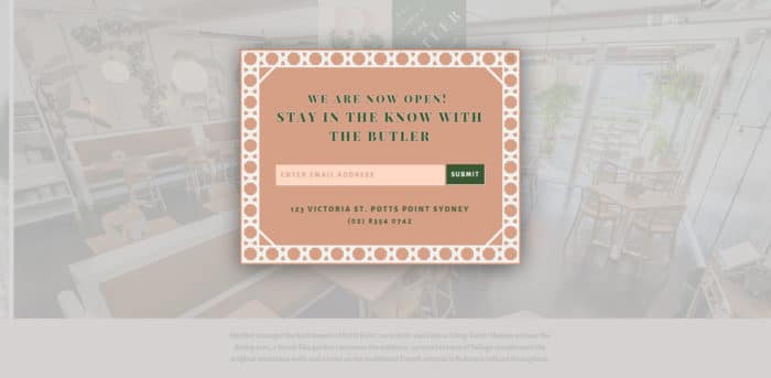
So how should you customise your under construction page? First of all, provide a way for visitors to sign up for notifications about the site and the business. This could be in the form of a popup window that greets them when they first arrive on the page or a field on the page itself where they can enter their email address. Like the page, the popup should be designed to match your brand.
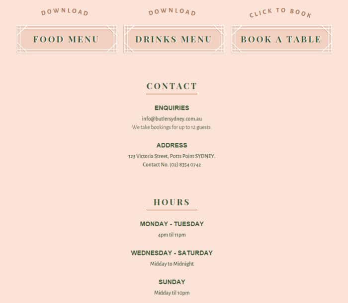
It’s also a good idea to include as many contact details as possible, including your phone number, email address and street address. Make it clear what your hours are so that if people can’t browse your website, they can still visit your venue. For organisations that host a lot of events, include a calendar for visitors to consult. The calendar, along with menus, brochures, programmes, etc., can be downloaded as a PDF or sent via email upon request.
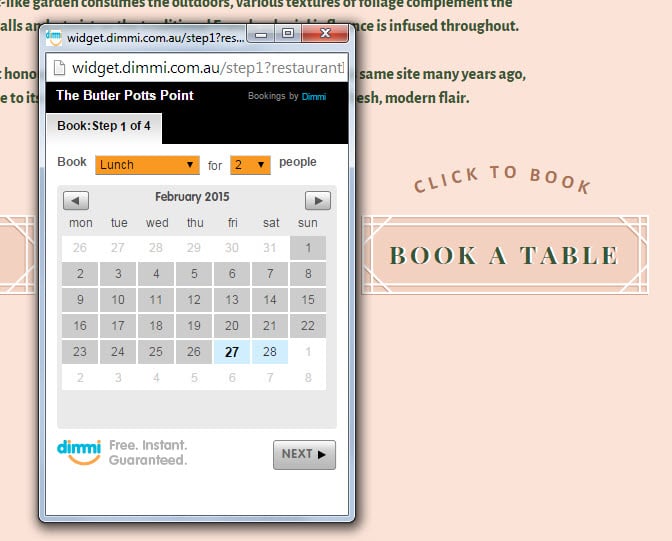
As for appointments and bookings, your phone number or email address may suffice, but you could make the page more interactive by inserting a function that allows visitors to set up a time right on the page.
Images are not necessary and could be a bit distracting for an under construction page, but it’s important that you make your logo clearly visible to keep the brand in front of potential customers at all times. If you wish, you can include a single picture of your office or venue as a visual aid or a simple map to show the location. This could be useful when undergoing extensive renovations or moving to a new location.
You don’t have to write much text on the under construction page, unless you feel you need to introduce new aspects of the physical business, such as design or location. But it may be reassuring to potential and existing customers to emphasise that this page is only temporary and that the new website will be beautiful and functional. Then you can lead into what people can do in the meantime using the features on the under construction page.
Lastly, add a couple of social sharing icons linking to Facebook, Twitter, Instagram, Pinterest, etc. so that visitors can view your social networking pages and interact with you there. That’s a great way to keep them engaged by posting updates on the web building or renovation progress, reminding them that the venue is still in operation and fielding any questions they may have.
Moral of the story: if your web developer is content with using a default, uninformative under construction page while working on your new website, you should seriously consider hiring someone else who has your best interests at heart.
Feature image © Digital Storm
Author

James Fulton
Since founding the company in 2012, James has been the driving force behind SGD's success. As a visionary leader, he guides the SGD team, encouraging them to continually excel in digital design. James inspires a culture of growth, challenging each team member to surpass their own limits and set new standards in the field. This commitment to excellence not only propels personal development but also ensures SGD consistently delivers exceptional results for its clients.
Unlock Weekly Insights To Improve Your Website
Want to improve your website and digital marketing? Sign up to Marketing Monday for practical, up-to-date strategies on SEO, Google Ads, and website performance—delivered weekly.
No fluff, just results-driven advice. Unsubscribe anytime.
Next Article
Link AdWords to Google Analytics for Effective PPC
February 20, 2015Start a Project


