Whether you have an online business or not, eNewsletters are a great way to maintain regular contact with your audience. However, creating an eNewsletter can be a bit daunting when you first start out. What layout should you use? What content and images should you include? What should the font and colour scheme be? And most importantly, where should you place your call-to-action links? Don’t worry, we’re going to answer these and other questions below.
Template
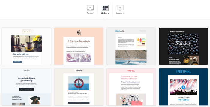
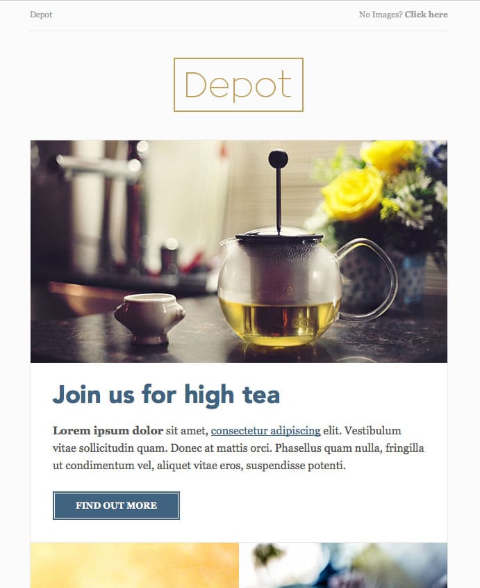
Before getting into the nuts and bolts of your eNewsletter, we’d like to recommend that you use a template. Select the basic template that best matches the layout you’d like to use and customise it accordingly. Then save it so that you won’t have to create a new eNewsletter every time. Remember to put your logo or name at the top of the email!
Content
Let’s begin by planning out the content, i.e. what you’re actually going to say to your audience. First of all, make sure your message is clear and focused. Don’t try to convey multiple messages with one eNewsletter or else your audience will get confused. You might need to start out with a lengthy email and whittle it down into a basic message.
Don’t forget to use links! After all, your eNewsletter should be a supplement to your website, not a substitute for it.
Layout
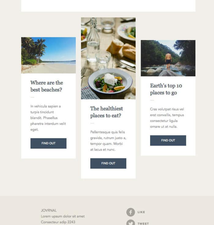
Since most people spend less than 30 seconds reading marketing emails, you’ll need to prioritise your content so that the main points jump out at the reader. Create a hierarchy with headings and clearly defined sections using dividers or borders.
Make your content “pop” by using white space and appropriate alignment (center if content is minimal, left-align if you have a lot of content–but use the same alignment throughout the eNewsletter).
Design
As a general rule, you should use the same colours in your eNewsletter that you use on your website and other marketing material. For instance, The Lowdown is easily recognisable as coming from SGD, because it has our traditional blue-white-grey colour scheme. You should also use colours to visually separate the header and footer from the body content.
Choosing a font can be tricky. It’s a safe bet to pick the font your brand normally uses, but depending on your message you may want to opt for something else. Regardless of the message, don’t use more than two different fonts (so as not to distract the reader), make sure the font is easy to see and keep the font size between 14 and 16 px.
Be careful with images. Done properly, the addition of photos can really enhance your message, but if not it can ruin the effect. Use only the most essential images, keep the file size to a minimum to avoid distortion and draw attention to the photos using white space or limited colour.
Calls-to-action
Calls-to-action link readers to external content or ask them to do something. These links can be images, buttons or text, but they should be short and clear, using active language, e.g. “Buy Now” or “Sign Up.” They should also be sized based on importance. Make them stand out from the background with a different colour or style. The reader should know what you want them to do.
Time to send
So you’ve created an awesome eNewsletter. When is the best time to send it? Unfortunately, we can’t answer that question for you. The best time depends on the demographics of your audience. You may have to do some experimenting and research to get it just right.
A few last words…
If you’re not ready to fly solo yet, keep in mind that each of our SGD Maintenance Plans includes the design and distribution of at least one eNewsletter. We will design and send out the eNewsletter on your behalf to a database that you provide to SGD with a maximum of 2,500 subscribers. If you have a high number of subscribers, we can tailor a plan to suit your needs.
And if you haven’t already, please subscribe to The Lowdown for monthly news from SGD!
Feature image © Bloomua
