15 years ago the worldwide web was a very different place, it was a far more plain and visually only had the barest of bones. Sites were static, simple and mostly only provided information. Social media was non-existent, there were few videos and definitely no Youtube, you needed a computer connected with a wire to a modem that took about 1 minute to get online and Google was well still Google but you get the idea.

As Internet speeds have improved and the net has become increasingly mobile and accessible so too have our websites become more intuitive and interactive with complex data visualization, new applications and utilities designed to connect in new and amazing ways.
Of course there is a difference between a full screen site and a scrolling site so lets have a quick look at that. A full screen site is designed to display all the content in a single frame, you don’t scroll down, it’s all visible in the browser. In this way you could say that it is similar to a glossy magazine cover with all the information contained on the front and clicking will take you to the individual information.

Compare this to a scrolling site where you can transition down the page to view the rest of the information as its no longer contained in the single frame.

Early web content was static, i.e the site wouldn’t change without intervention by the designer or the owner of the site. Now we have what is known as the web 2.0, which is a collaborative web, worked by designers. This includes blogging platforms (like this one), Social networks, online newspapers, and Internet banking ect… these are dynamic websites and the content generated by the user is king. Flash is great at providing a cool animated experience but they labor to handle the dynamic content that we crave in our current websites. Instead it is much easier to stack our information vertically as an alternative to trying to contain it all in a single screen and as such it’s used in the majority of websites.
The rise of the smartphone has forever changed the way we interact with the world, information and in particular the Internet. Now we have access to web content where ever and whenever we go, sitting at the train station, waiting for your girlfriend while she tries on clothes or while your boyfriend watches his team lose again. The touch screen has increased the ease of use but having a small screen has made a full screen website practically impossible to use. Instead, combined with the natural gesture of swiping, the screen has lent itself to the development of scrolling sites to provide a viable way to provide content.

Not to long ago you could safely assume most content would look the same across all PC’s because browsers had a narrow array of sizes. But when you go out a search the web now you find a massive number of broswers filling a range of different sizes. A normal full screen site might look amazing on a fixed size but once you start mess with the height and width that perfect looking website can look atrocious. Using a scrolling site, where you can stack a website vertically at varying heights, the problem is all but eliminated.
This may seem like we are suggesting that full screen sites are done and dusted but that’s simply not true, every single day a new amazing full screen site is made and released on the web. The sites are usually visually astonishing and pushing the very boundaries of web development. But the content is usually static and contains very little text and information and rarely works on mobile devices and its hear that the scrolling website has the advantage
Today’s web is very much directed towards scrolling sites and as web technologies improve we are seeing a bevy of new, exciting, visually astounding scrolling sites materialize. A more powerful and flexible CSS plus faster javascript compiling have given designers a chance to be creative and supercharge just what exactly we can do on scrolling website.
One of the most obvious way a scrolling site is pushing the boundaries of website development is by taking advantage of a scrolling event. This could include SVG animation, playing an embedded fullscreen video or just simply activating a CSS effect. An effective and popular tool is parallax scrolling, which occurs when an element is directly tied to the scroll movement. When this happens we have different layers on page moving at different speeds which creates an amazing sense of depth to 2D website.
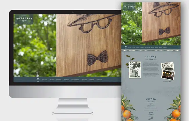
As we said earlier fullscreen websites are wonderful and immersive sites but have limitations. But instead we can use a hybrid fullscreen/scrolling site that allows us to create the visual impact while also providing the dynamic content. The fullscreen model has the immersive impact we are trying to create and by tying it to a scroll system we can provide more detail on the element or content we have chosen.
While a scrolling website can be amazing they can get out of hand and dissuade users to full immerse themselves within the content if its just blocks of text. Instead using pictures, animations and making them interactive we can create what could almost be described as a story the viewer follows as they move down the page creating a truly gripping experience.
Scrolling websites are the staple of today’s internet because of the ease of use and the availability across so many different platforms from different browsers to different viewing tools i.e. smartphones, tablets and computers. This along with the upsurge in dynamic websites to captivate users has meant that so many of the websites we use daily employ scrolling techniques. The explosion of creative ways to increase and broaden the visual appeal just goes to prove this element is pivotal in the way we will be view website for a while.
Author

James Fulton
Since founding the company in 2012, James has been the driving force behind SGD's success. As a visionary leader, he guides the SGD team, encouraging them to continually excel in digital design. James inspires a culture of growth, challenging each team member to surpass their own limits and set new standards in the field. This commitment to excellence not only propels personal development but also ensures SGD consistently delivers exceptional results for its clients.
Next Article

The Lowdown - June 2014
June 18, 2014


Get Started
"*" indicates required fields

Tell us about your project
"*" indicates required fields